
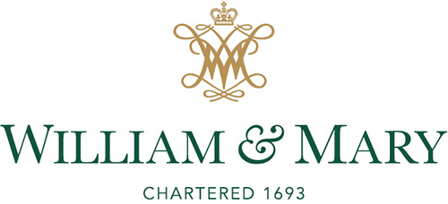
Calling it traditional with modern character, the College of William & Mary debuted a new family of university marks, including a new official logo.
At the William & Mary Board of Visitors meeting Tuesday, the college’s Visual Identity Committee introduced a new set of official symbols, four official colors, and a style guide outlining acceptable and unacceptable uses of university marks.
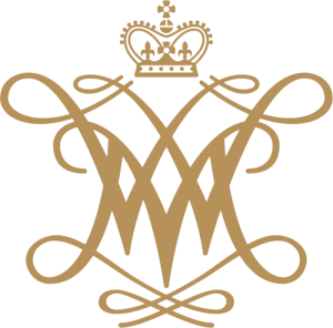
The presentation was highlighted by the unveiling of a new official university logo, consisting of the William & Mary “cypher,” the school’s name and the phrase “Chartered 1693.”
Associate Director of Design Justin Schoonmaker said the inclusion of a traditional school symbol — the cypher — with a combination of serif and sans serif fonts created a logo that referenced the college’s past with a modern character. The four colors — William & Mary Green, William & Mary Gold, Spirit Gold and William & Mary Silver — retain the college’s traditional color scheme.
Schoonmaker said the new symbols and adjusted colors would also help define the college’s brand, a notion with which William & Mary President Taylor Reveley agreed.
“They’re going down with refreshing smoothness,” he said.
Schoonmaker said William & Mary’s current effort to clarify its visual identity began in 2010. College staff examined various university marks, determining two — the cypher and the college seal — had the highest levels of community identification.
Partnering with Brooks-Adams Research, Schoonmaker said the college consulted members of the William & Mary community to better understand which marks were most associated with the college and how they could be incorporated into a new logo.
Receiving more than 5,800 constituent responses, Schoonmaker said 70 percent preferred the cypher over the seal, leading to its inclusion in the new design.
The earliest recorded appearance of the cypher is on boundary stones placed in 1714 to define the college’s property lines. The seal dates to 1694, and was issued by the English College of Heralds.
While the cypher is emphasized in many of the new designs, Schoonmaker said the seal would remain an official symbol used for special occasions, including diplomas, memorial plaques and on the college mace.
The style guide includes other marks and symbols for use by the college’s various offices, departments and students groups, which Schoonmaker said were “derivative” of the new logo.
It also includes a list of retired marks that should not be used by affiliated organizations. Although the marks are no longer sanctioned by the school, Schoonmaker said it was not forcing groups to adopt the new symbols immediately.
“We’re encouraging people to come online with us, to help us grow the brand in an attractive way and less an approach of us coming down with the hammer,” he said. “The approach we’re taking is not, ‘Hey everybody, stop using what you’re using and get new stuff.’”
University spokesman Brian Whitson said reaction to the new logo and style guide among campus organizations had been positive.
“When you provide people with a beautiful option, they want to use that,” he said.
The school’s athletic marks, including the script Tribe and the design of the griffin, have remained untouched.

Schoonmaker said using the new logo and marks would not create additional costs for the college, as groups would be asked to switch to the new logo gradually.
“For example, as people run out of letterhead, they can get new ones with the new marks,” he said. “What’s existing in budgets for maintenance is what it will cost.”
The new logo and style guide are the latest chapter in a discussion dating back at least eight years. In 2006, the NCAA ruled against the college’s inclusion of two feathers in its athletic logo, arguing the imagery was potentially hostile or abusive to American Indians.
William & Mary introduced a new logo in 2007, which then-Vice President for Student Affairs Sam Sadler called “evolutionary, not revolutionary.” That logo received mixed reactions from the college community, however, and has since been included on the school’s list of retired marks.
Reveley said the visual identity process had been lengthy, but its results were worth the wait.
“We’ve been at this for a long time,” Reveley said. “It’s had the gestation of a mastodon cubed.”